Streamline Your App Design with a Travel Booking UI Kit
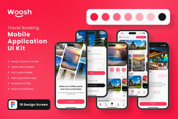
Imagine transforming your travel app concept from a rough idea into a polished, professional prototype in a matter of hours, not weeks. This is the power of a well-crafted mobile UI kit. For designers and developers looking to jumpstart their workflow, a comprehensive resource like the Travel Booking Application Mobile UI Kit offers a significant creative advantage. It provides a structured foundation, allowing you to focus on unique features and user experience rather than starting every screen from scratch.
This particular kit is a collection of 19 pixel-perfect screen designs, meticulously crafted for Figma. It's built for those who value efficiency and quality. Instead of wrestling with basic layouts, you receive a library of over 80 pre-designed UI elements—from buttons and forms to navigation bars and cards. These are not just static images; they are fully editable, vector-based components. This means every element is 100% scalable, ensuring your designs look crisp on any screen size, from smartphones to tablets. The use of symbol objects and a fully layered structure makes customization intuitive, letting you maintain visual consistency across your entire application.
Practical Applications and Creative Flexibility
The true value of a design asset lies in its adaptability. While this kit is specialized for travel booking interfaces, its clean, modern typography and component-based approach have broader applications. Consider these scenarios:
- Rapid Prototyping: Quickly assemble interactive prototypes for client presentations or user testing, significantly speeding up the feedback loop.
- Brand Identity Systems: Use the consistent style of the UI elements as a starting point for developing a cohesive brand identity for a travel startup, including logo concepts and marketing materials.
- Design System Foundations: Extract and adapt the color palettes, typography scales, and component styles to build a larger design system for related digital products, such as a companion website or social media graphics.
- Educational Tool: For new designers, studying the structure of a professional UI kit is an excellent way to learn about mobile design principles, layout grids, and interactive element states.
The kit's editable nature is key. You can easily add or subtract elements to suit your project's specific needs. Changing the color style to match a brand's palette is straightforward, and the inclusion of free fonts and icon vectors reduces additional asset hunting. This flexibility makes it a valuable resource not just for a single project, but as a reusable part of your design toolkit.
Tips for Integrating UI Kits into Your Workflow
To get the most out of resources like this, a thoughtful approach is essential. First, always review the license to ensure it fits your intended use, whether for personal projects or commercial client work. Next, don't treat the kit as a finished product. Use it as a starting point. Customize the screens to reflect the unique flow and branding of your application. Test how the provided typography pairs with other typefaces you might use for headings or body text to create a unique yet harmonious visual hierarchy.
Pay attention to readability and user flow. A beautiful screen is useless if navigation is confusing. Use the kit's components to build a logical user journey. Finally, leverage the scalable vectors to ensure your designs are future-proof and adaptable to different devices. The goal is to use these pre-built assets to enhance your creative process, not replace your design thinking.
Choosing the right design resources is about finding tools that elevate your work and streamline your process. A thoughtfully designed UI kit does more than save time; it provides a framework for creativity, ensures a level of professional polish from the outset, and helps turn ambitious ideas into tangible, high-quality digital experiences. It’s an investment in both efficiency and excellence.